
Seattle Book Club
Visual Brand Identity


Overview
I was introduced to Sam from Seattle Book Club through a previous client. Sam approached me to develop a brand identity and marketing materials that would enhance her business's visibility and community engagement. Seattle Book Club is a community-focused organization that offers free pickup of unused books to redistribute them sustainably and affordably within the Seattle area. The goal was to create a cohesive and professional brand that reflects their values of sustainability, accessibility, and community support.
Process
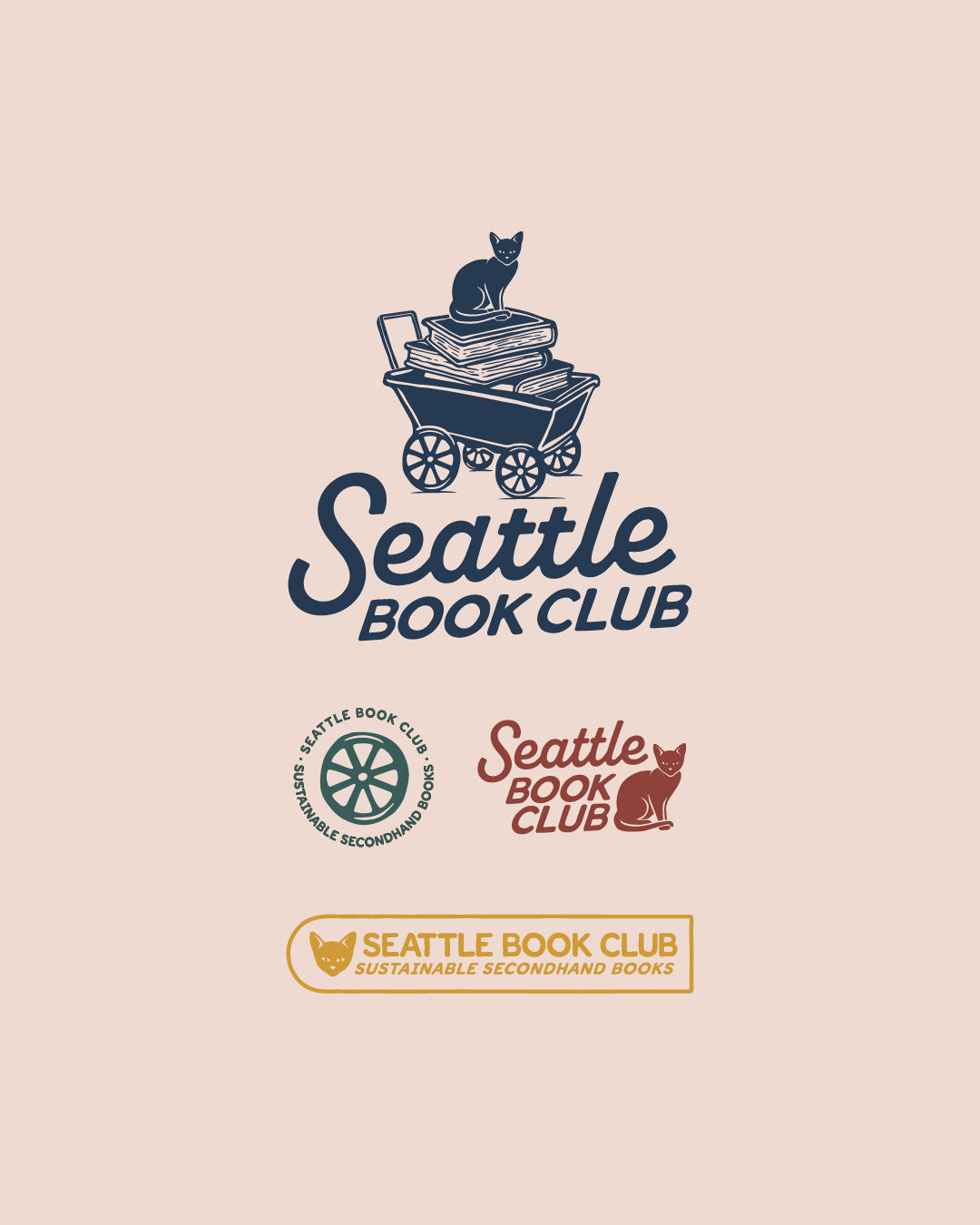
I started by presenting two mood boards to Sam, who selected the vintage academic inspiration. She also shared a unique idea for the logo: incorporating an old-timey merchant or peddler, inspired by a psychic's comment about her past life as a merchant. This idea fit well with the vintage academic theme and added a fun, personal story behind the logo.
Using this direction, I developed a brand identity that included:
• A new logo featuring the vintage merchant/peddler concept
• A bright, optimistic, and eco-friendly color palette
• A professional yet approachable typography system
• A comprehensive brand guidelines booklet covering logo usage, color specifications, typography rules, and visual style recommendations
In addition to the brand guidelines, I designed bookmarks and flyer/social media templates to support Seattle Book Club’s marketing efforts.
Results
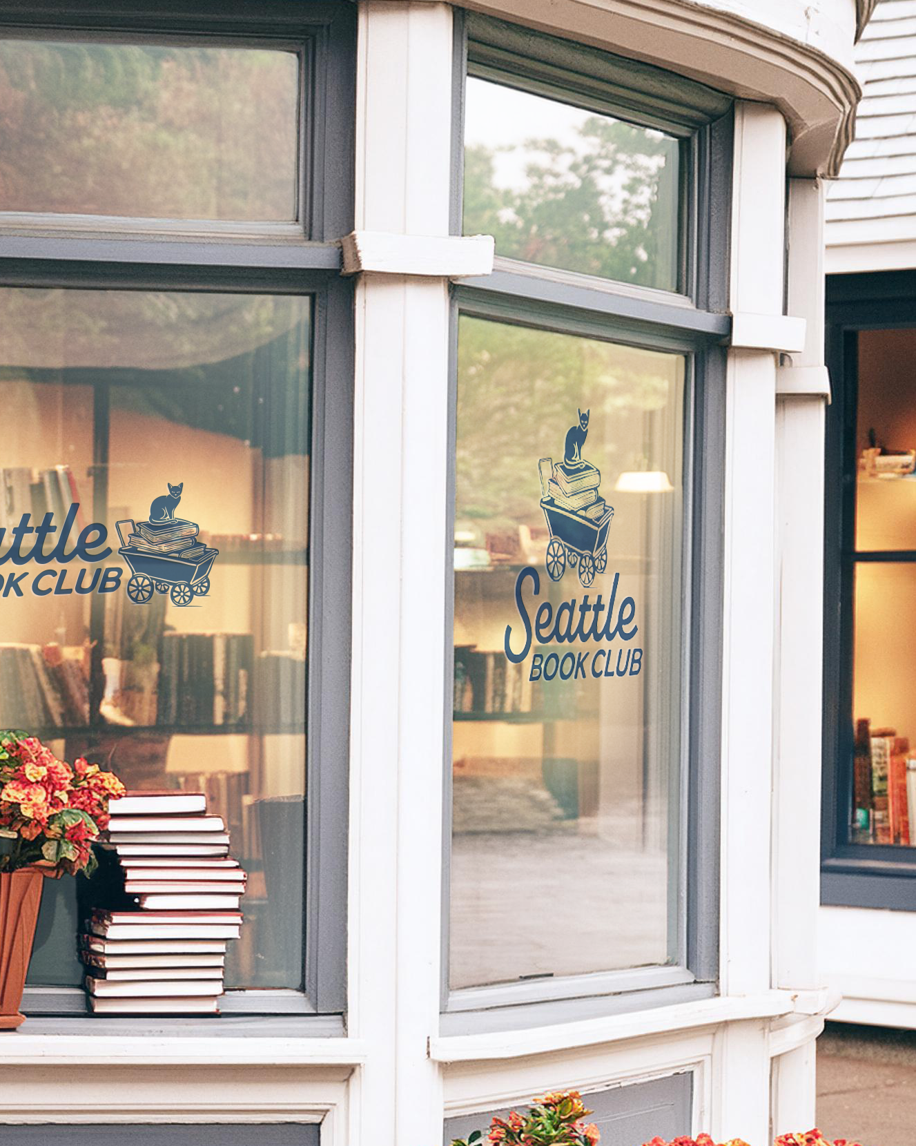
Today, the Seattle Book Club boasts a strong and recognizable brand. The cohesive look and feel of their marketing materials have been positively received. The brand guidelines booklet has ensured consistent and professional communication, reinforcing trust and reliability within the community. Sam loves the new brand identity and marketing materials, and they have helped Seattle Book Club establish a stronger presence in the community.
